
A great Photoshop brush feels effortless when you use it: one click, one stroke, and the effect appears exactly where you need it. But creating a brush that feels natural, stays sharp at different sizes, and works consistently requires much more than turning an image into a preset.
Behind every useful brush are several decisions: the quality of the source image, tonal contrast, edge cleanup, spacing, scattering, pressure response, testing, naming, and organization.
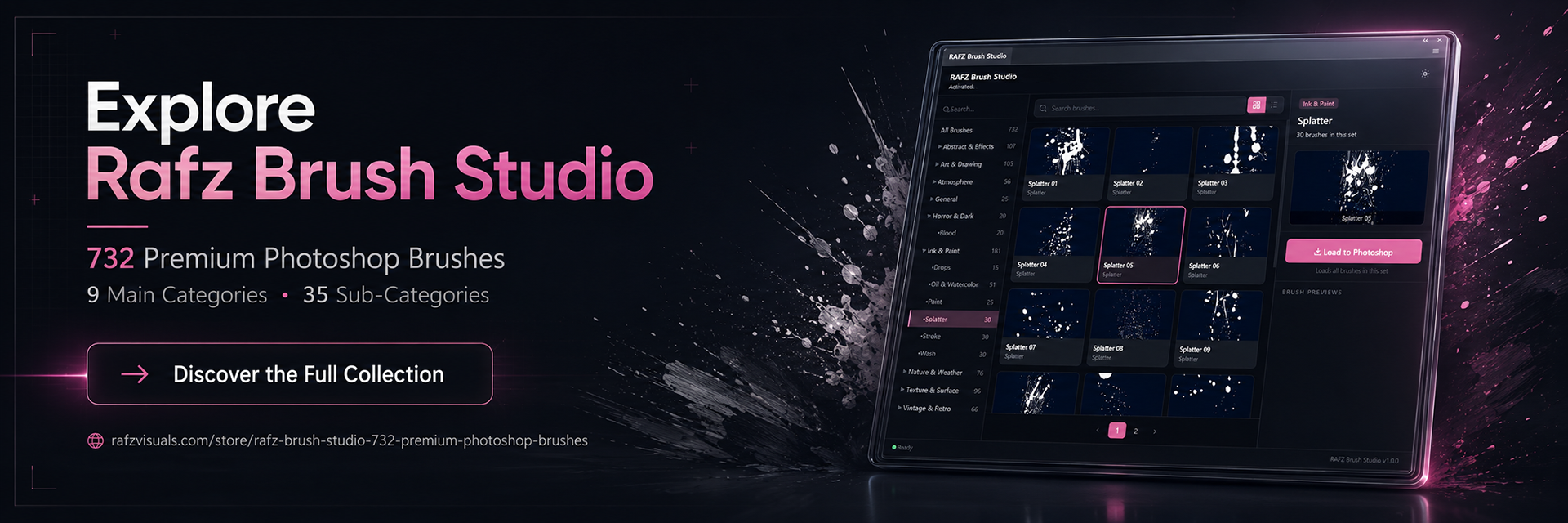
We learned how important these details are while building Rafz Brush Studio — 732 Premium Photoshop Brushes organized into 9 main categories and 35 sub-categories.

This guide explains the complete process, from preparing source material to exporting a professional Photoshop brush pack.
In this guide:
What a Photoshop Brush Actually Is
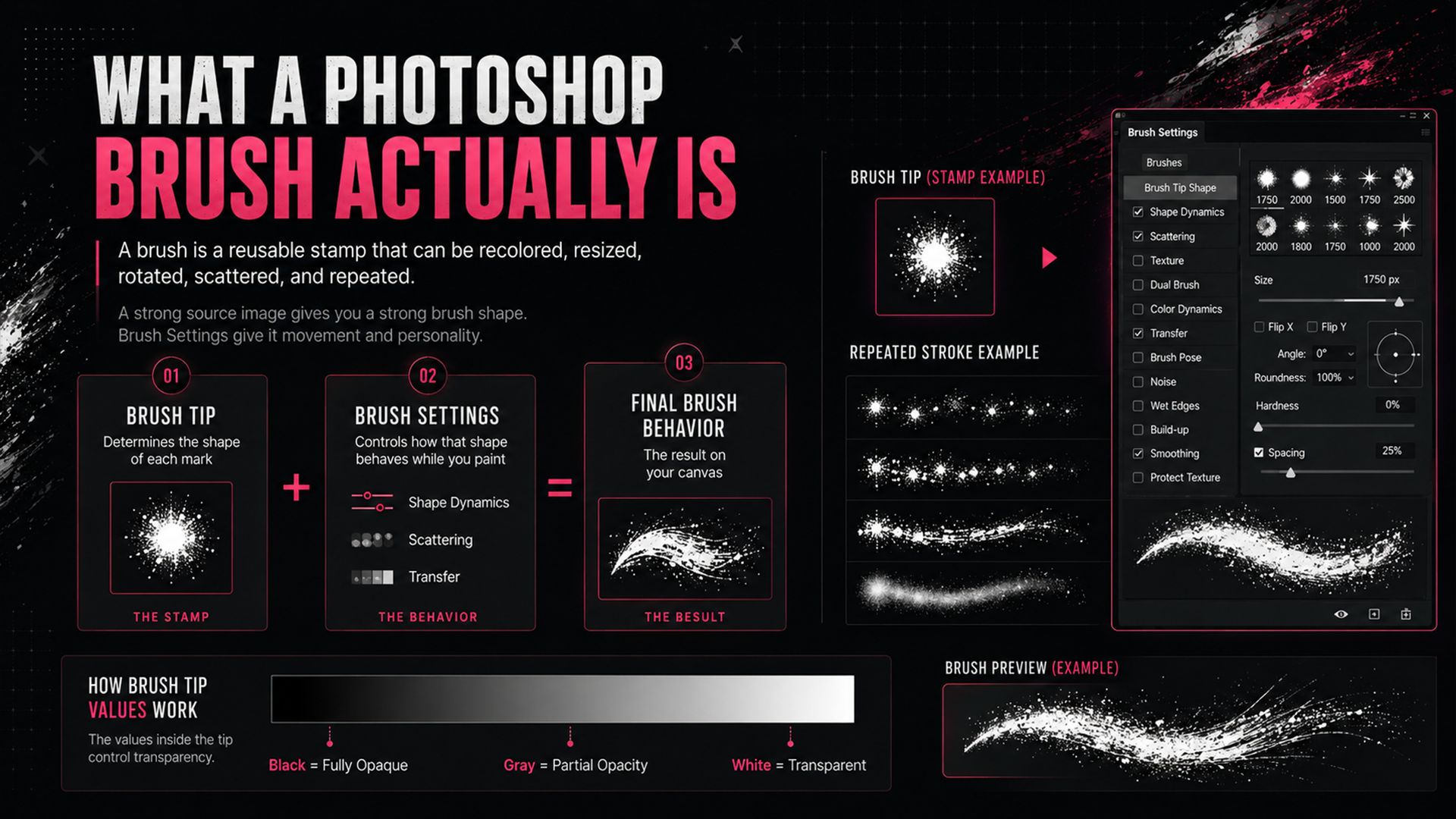
A Photoshop brush is built from two main parts:
The brush tip, which determines the shape of each mark
The brush settings, which control how that shape behaves while you paint
The brush tip is interpreted as a grayscale image:
Black creates a fully opaque brush mark
Gray creates partial opacity, depending on how dark or light it is
White becomes transparent and does not paint
This means you are not simply designing a picture. You are creating a reusable stamp that can be recolored, resized, rotated, scattered, and repeated across a canvas.
A strong source image gives you a strong brush shape. The Brush Settings panel gives that shape movement, variation, and personality.
Step 1: Source or Create the Brush Image
Many weak brush packs fail before the brush is even created because the source material is too small, too compressed, or poorly separated from the background.
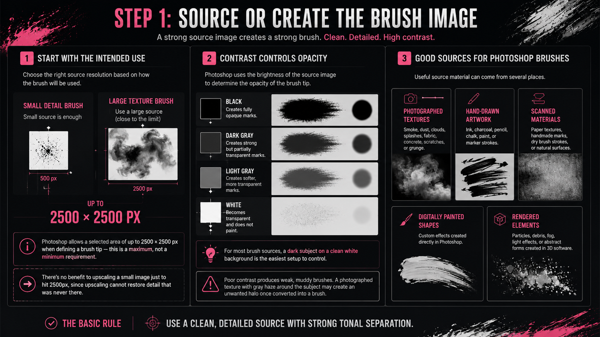
Start with the intended use
Before choosing a source image, decide how the brush will be used. A small detail brush does not need the same source resolution as a large smoke, cloud, grunge, or texture brush.
Photoshop allows a selected area of up to 2500 × 2500 pixels when defining a brush tip — this is a maximum, not a minimum requirement. For brushes intended to be used at large sizes, prepare the source artwork close to this 2500px ceiling. Smaller brushes can use a smaller source image, depending on their intended scale — there's no benefit to upscaling a small image just to hit 2500px, since upscaling cannot restore detail that was never there.
Contrast controls opacity
Photoshop uses the brightness of the source image to determine the opacity of the brush tip:
Black creates fully opaque brush marks. Dark gray creates strong but partially transparent marks. Light gray creates softer, more transparent marks. White becomes transparent and does not paint.
For most brush sources, a dark subject on a clean white background is the easiest setup to control.
Poor contrast produces weak, muddy brushes. A photographed texture with gray haze around the subject may look acceptable as a regular image but create an unwanted halo once converted into a brush.
Good sources for Photoshop brushes
Useful source material can come from several places:
Photographed textures — smoke, dust, clouds, splashes, fabric, concrete, scratches, or grunge
Hand-drawn artwork — ink, charcoal, pencil, chalk, paint, or marker strokes
Scanned materials — paper textures, handmade marks, dry brush strokes, or natural surfaces
Digitally painted shapes — custom effects created directly in Photoshop
Rendered elements — particles, debris, fog, light effects, or abstract forms created in 3D software
Whenever possible, photograph or scan the subject against a simple background and use the highest practical image quality. For photographed textures, shoot in even lighting and avoid heavy JPEG compression.
The basic rule is simple: use a clean, detailed source with strong tonal separation.
Step 2: Prepare the Image for Brush Conversion
Photoshop automatically converts color images to grayscale when you define a brush tip, but preparing the tones manually gives you much better control over the result.
Convert the image to black and white
A Black & White Adjustment Layer is usually more flexible than immediately desaturating the image — it keeps the conversion non-destructive, and lets you control how individual colors are translated into grayscale without permanently altering the original layer.
For some sources, a Gradient Map or channel-based conversion may produce better separation. The goal isn't merely to remove color — it's to build a clear opacity map for the brush.
Place the shape on a clean background
Because white becomes transparent in the final brush tip, the background should normally be clean and close to pure white. Use Levels or Curves to brighten unwanted background detail while keeping the main shape dark and readable.
Check the image at high zoom — dust, compression artifacts, and pale gray patches can become visible around the brush once it's used on a dark canvas.
Don't destroy every soft edge, though. Smoke, clouds, dust, and fog often need gradual gray transitions to feel realistic. The goal is to clean the background without flattening the natural transparency of the subject.
Refine the shape
Use masks, Levels, Curves, Dodge and Burn, or a soft brush to remove unwanted areas and strengthen important details. Depending on the source, you may also need to:
Remove isolated particles that don't support the main shape
Fill accidental gaps
Reduce noise
Separate overlapping forms
Improve the silhouette
Crop unnecessary empty space
Sharpen only when necessary
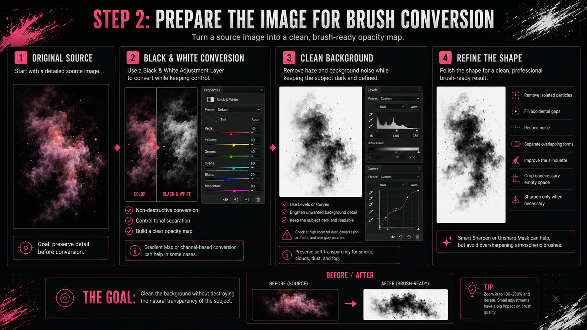
A small amount of Smart Sharpen or Unsharp Mask can help a soft source retain detail, but sharpening shouldn't be automatic — smoke and atmospheric brushes often look worse when oversharpened. Judge the result based on the intended effect, not a universal sharpening value.
Step 3: Define the Brush Tip
Once the source image is ready:
Select the artwork with the Rectangular Marquee Tool (or another selection tool)
Keep the selection reasonably close to the shape, leaving enough space for soft edges
Go to Edit > Define Brush Preset
Enter a clear name
Select OK
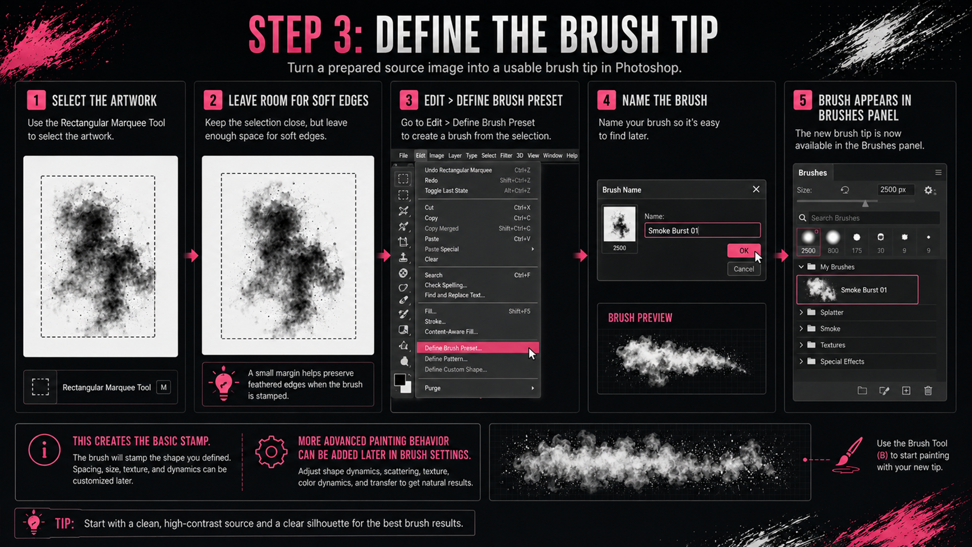
The new brush tip will appear in the Brushes panel. At this stage, you've created the basic stamp — it may already work well for single-click effects, but brushes designed for painting, particles, textures, or repeated strokes usually need additional settings.
Step 4: Build the Brush Behavior
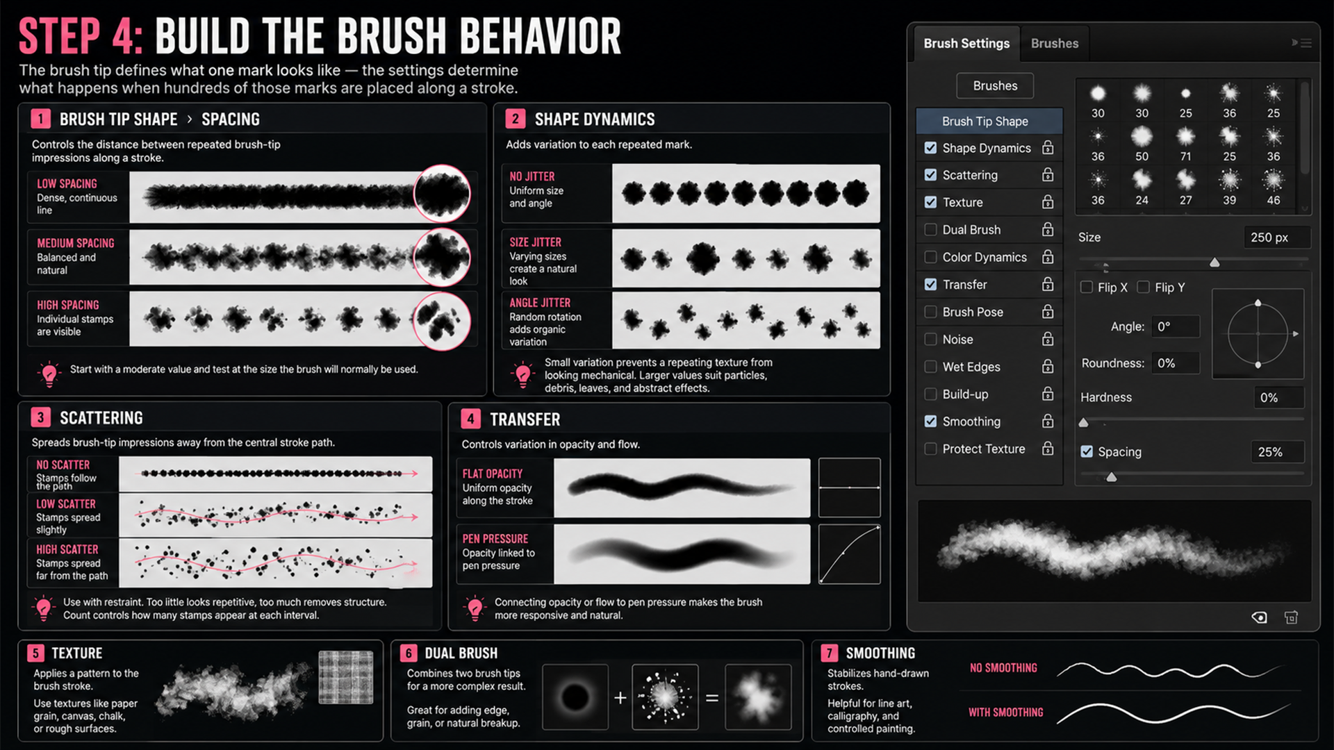
Open Window > Brush Settings. The brush tip defines what one mark looks like — the settings determine what happens when hundreds of those marks are placed along a stroke.
You don't need to activate every option. In most cases, a few carefully chosen settings produce better results than a large number of random adjustments.
Brush Tip Shape
Controls basic size, angle, roundness, hardness, and — most importantly for custom image-based brushes — Spacing.
Spacing controls the distance between repeated brush-tip impressions along a stroke:
Very low spacing creates a dense, continuous line
High spacing reveals individual stamps
Excessively low spacing may reduce performance without a visible improvement
Excessively high spacing may make a smooth stroke look disconnected
There's no single correct value — a soft round brush, a charcoal brush, and a debris brush all require different spacing. Start moderate and test at the size the brush will normally be used.
Shape Dynamics
Adds controlled variation to each repeated mark:
Size Jitter — changes the size of individual stamps
Angle Jitter — rotates individual stamps
Roundness Jitter — changes the proportions of the brush shape
Control — connects behavior to pen pressure, tilt, direction, fade, or another input
Small amounts of variation prevent a repeating texture from looking mechanical. Larger values suit particles, leaves, debris, splashes, and abstract effects. For directional elements like hair, grass, rain, or bristles, choose angle controls carefully — random rotation can destroy the natural direction of the effect.
Scattering
Spreads brush-tip impressions away from the central stroke path — especially useful for dust, snow, sparks, debris, splatter, stars, leaves, and small particles.
Use scattering with restraint. Too little looks repetitive, but too much removes the brush's structure entirely. The Count setting controls how many stamps appear at each interval — increasing both Count and Scattering creates denser effects, but can also slow performance and add visual noise.
Transfer
Controls variation in opacity and flow. For tablet users, connecting opacity or flow to pen pressure makes a brush feel more responsive — especially useful for ink, charcoal, pencil, paint, calligraphy, and other traditional-media simulations. For atmospheric effects, subtle opacity variation helps repeated stamps blend more naturally.
Texture
Applies a pattern to the brush stroke — useful for paper grain, canvas, chalk, dry paint, and rough surfaces. The pattern should support the brush tip rather than compete with it. Test on both light and dark backgrounds, since texture blending can behave differently depending on painting color and blend mode.
Dual Brush
Combines two brush tips for a more complex result. It can produce excellent effects, but adds complexity and may affect performance — use it when a single brush tip can't create the required edge, grain, or breakup.
Smoothing
Helps stabilize hand-drawn strokes — useful for line art, calligraphy, and controlled painting, but less important for single-click texture brushes. A brush designed for fast, expressive strokes may feel delayed if smoothing is too strong.
Step 5: Save the Complete Brush Preset
After customizing the brush:
Open the Brushes panel
Select the Create New Brush icon
Name the brush clearly
Choose whether to include tool settings such as opacity or color
Select OK
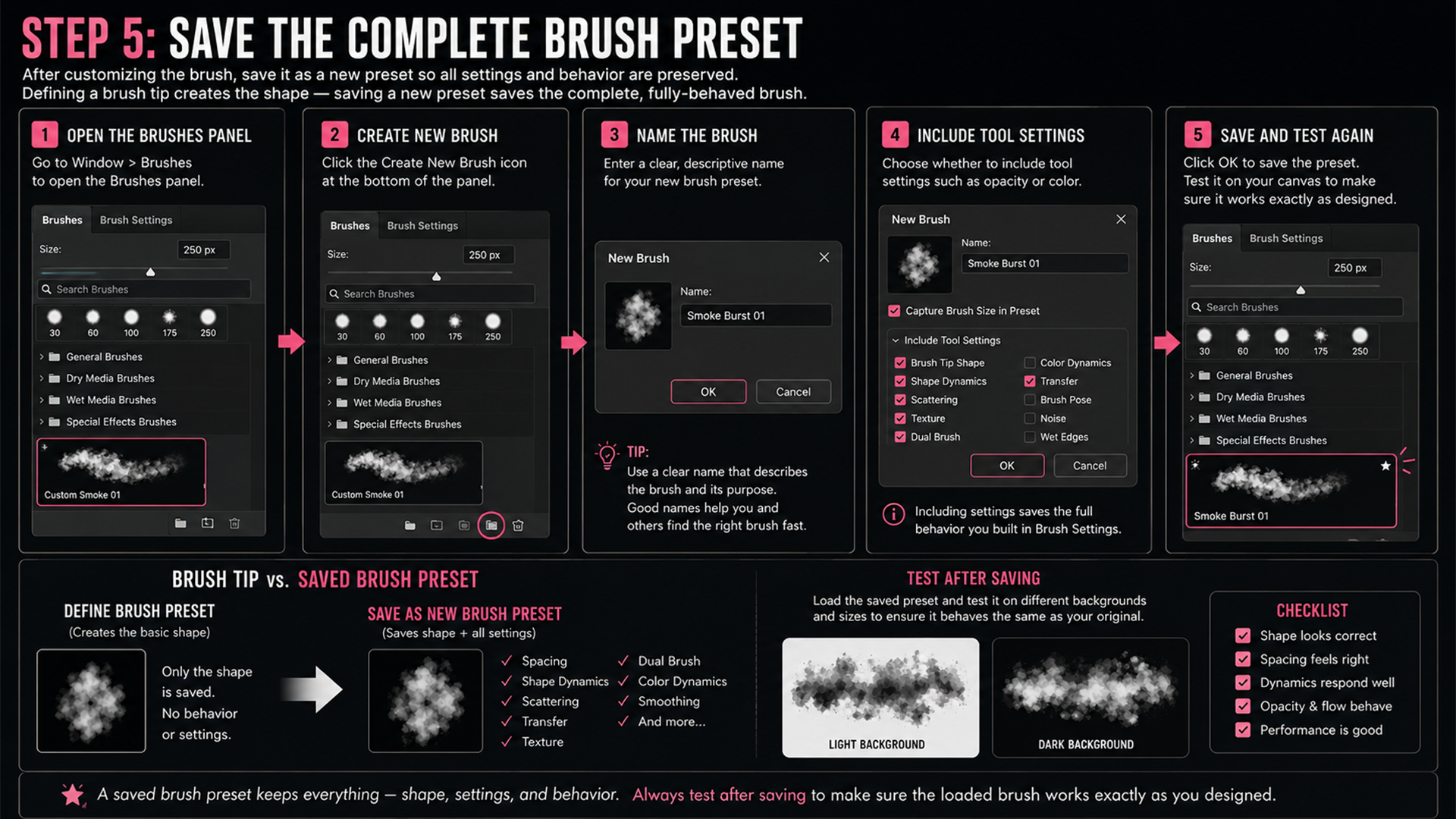
A saved brush preset retains the current brush settings — including the shape and behavior you built in the Brush Settings panel. Defining a brush tip only creates the basic shape; saving a new preset afterward is what preserves the finished, fully-behaved version of the brush.
When the brush is part of a pack, test the saved preset again after creating it to make sure the loaded version behaves exactly like the version you designed.
Understanding the File Types
This is where a lot of brush tutorials get vague, so here's the clear version:
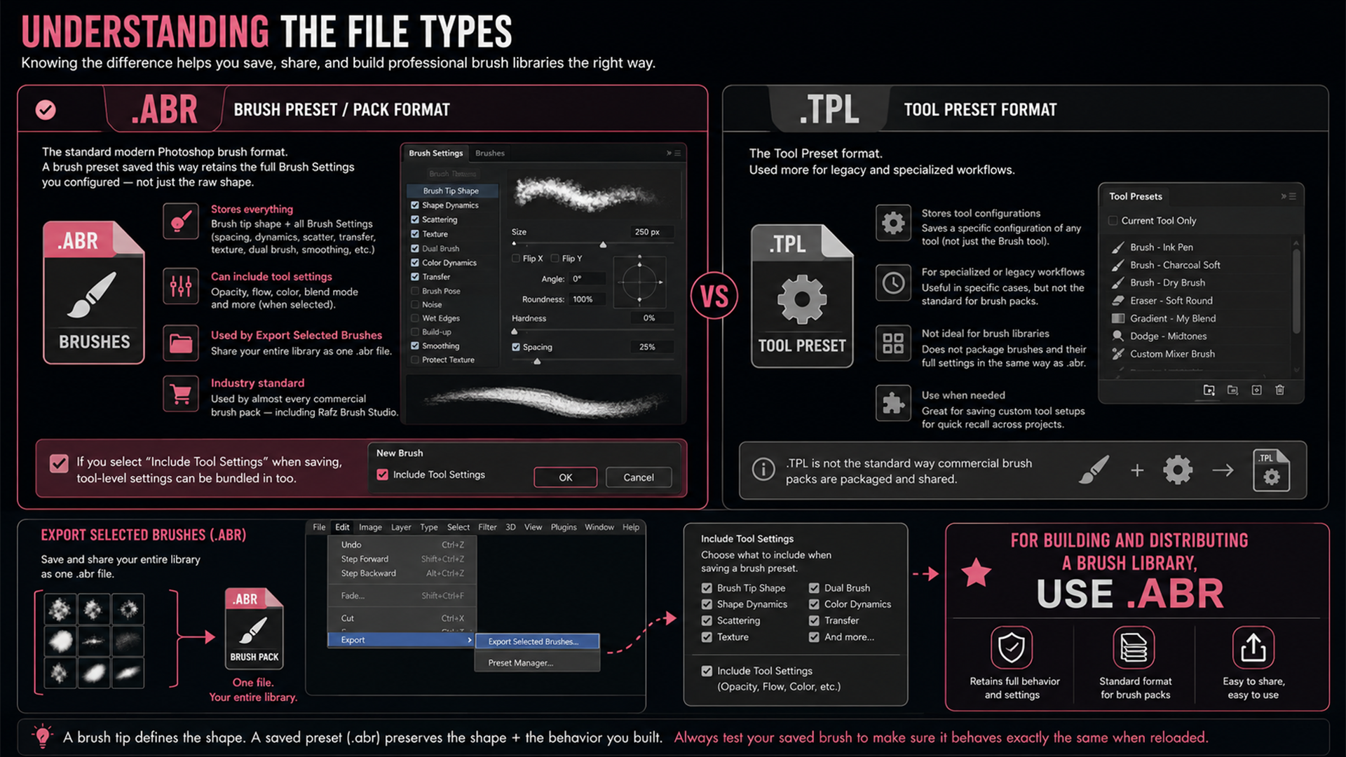
.abr is the standard modern Photoshop brush preset and pack format. A brush preset saved this way can retain the full Brush Settings you configured — spacing, dynamics, scatter, transfer, texture, and more — not just the raw shape.
If you select "Include Tool Settings" when saving, opacity, color, and other tool-level settings can be bundled in too.
This is the format used by Export Selected Brushes to share a whole library as one file, and it's what almost every commercial brush pack — including Rafz Brush Studio — is built and distributed as.
.tpl is the Tool Preset format. It's used more for legacy and specialized Tool Preset workflows — saving a specific configuration of any tool (not just the Brush tool) for quick recall later. It's a useful format in specific cases, but it isn't the standard way commercial brush packs are packaged and shared.
For building and distributing a brush library, .abr — with tool settings included where relevant — is the format to design around.
Step 6: Test the Brush at Real-World Scale
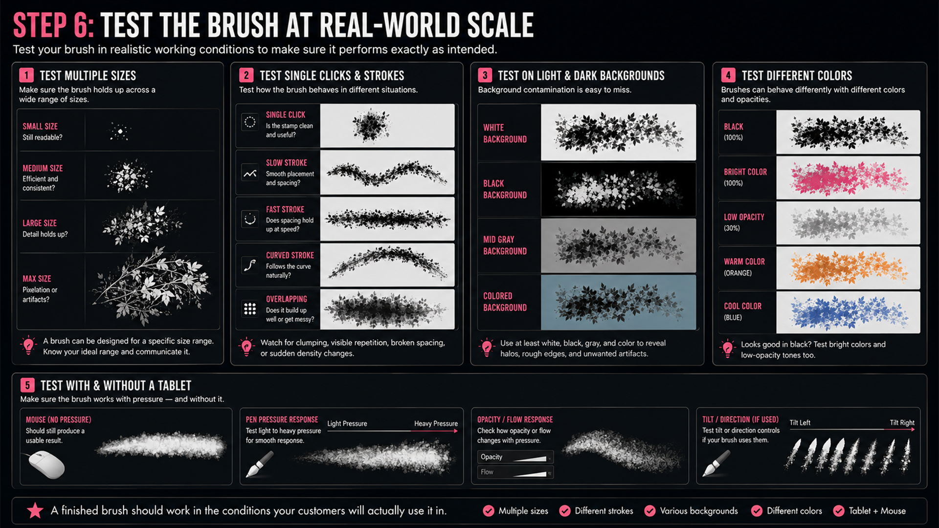
One of the most common mistakes is testing a brush at only one size and on only one background. A finished brush should be tested in realistic working conditions.
Test multiple sizes
Small sizes — does the shape stay readable, or does it become a blob?
Medium sizes — does it create the intended effect efficiently?
Large sizes — does the source detail stay sharp enough?
Maximum practical size — does it reveal pixelation or background artifacts?
Not every brush needs to work perfectly at every size — a brush can be designed for a specific size range, as long as that range is understood and communicated.
Test single clicks and strokes
Some brushes are one-click stamps; others are for continuous painting. Test single-click placement, slow strokes, fast strokes, curved strokes, and repeated overlapping strokes. Watch for clumping, visible repetition, broken spacing, or sudden density changes.
Test on light and dark backgrounds
Background contamination is often invisible when tested only on white. Use at least a white background, a black background, a mid-gray background, and a colored background — this makes halos, rough edges, and unwanted gray areas far easier to spot.
Test different colors
A brush that looks good in black may behave differently in bright colors or low-opacity tones. This matters especially for commercial packs, since customers will apply the brush in many different contexts.
Test with and without a tablet
If the brush uses pen pressure or tilt, test it with a compatible tablet — and also check how it behaves with a mouse. A pressure-dependent brush should still produce a usable result when pressure input isn't available.
Step 7: Organize the Brush Pack
Creating one brush is a technical task. Building a large, usable brush library is an information-design problem.
Group brushes by function
Organize according to how people will actually search — Smoke, Dust, Fire, Water, Clouds, Grunge, Cracks, Light, Particles, and so on. Functional categories are usually more helpful than broad visual ones; a designer looking for rain shouldn't have to search through unrelated scratches and concrete textures to find it.
Use sub-categories when necessary
Large categories become hard to browse. A Smoke category, for example, could split into Wispy Smoke, Dense Smoke, Rising Smoke, Impact Smoke, and Atmospheric Fog. The right number of brushes per group depends on the interface and thumbnail quality — the goal is to keep every category easy to scan, not to hit a fixed number.
Name brushes descriptively
Weak naming:
Brush 01, Smoke 12, Texture Final, New Brush Copy
Better naming:
Smoke — Wispy Vertical 01, Dust — Ground Impact 03, Grunge — Rough Edge 02, Water — Fine Splash 05
Good names help users understand a brush before they even select it, and make future updates far easier to manage.
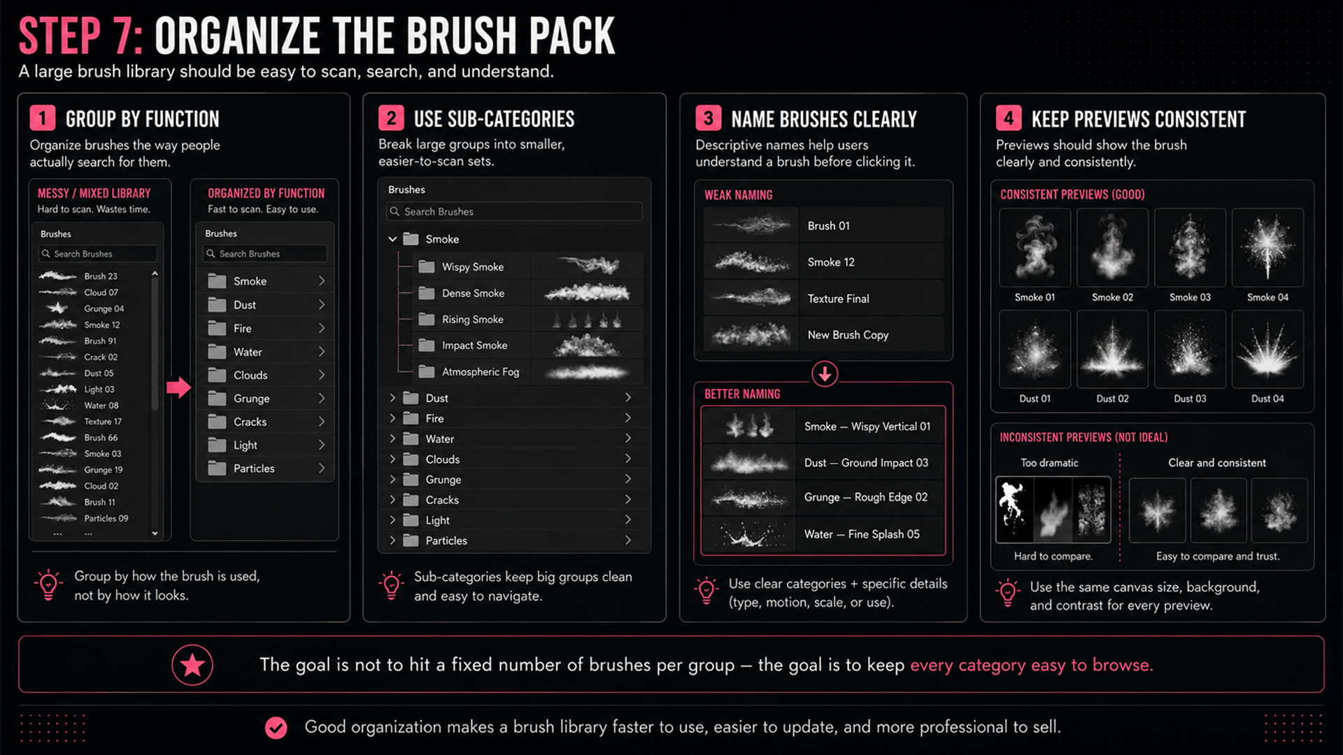
Keep previews consistent
Brush thumbnails and marketing previews should accurately represent the brush — similar canvas size, similar lighting and background, clear indication of scale, no excessive effects that hide the original brush. A dramatic preview may attract attention, but the customer should still understand what the brush itself actually contributes.
Step 8: Export and Back Up the Brush Pack
When the brushes are finished:
Select the brushes or brush group in the Brushes panel
Open the Brushes panel menu
Choose Export Selected Brushes
Save the brush library in a clearly named location
Import the exported file into a clean Photoshop setup and test it again
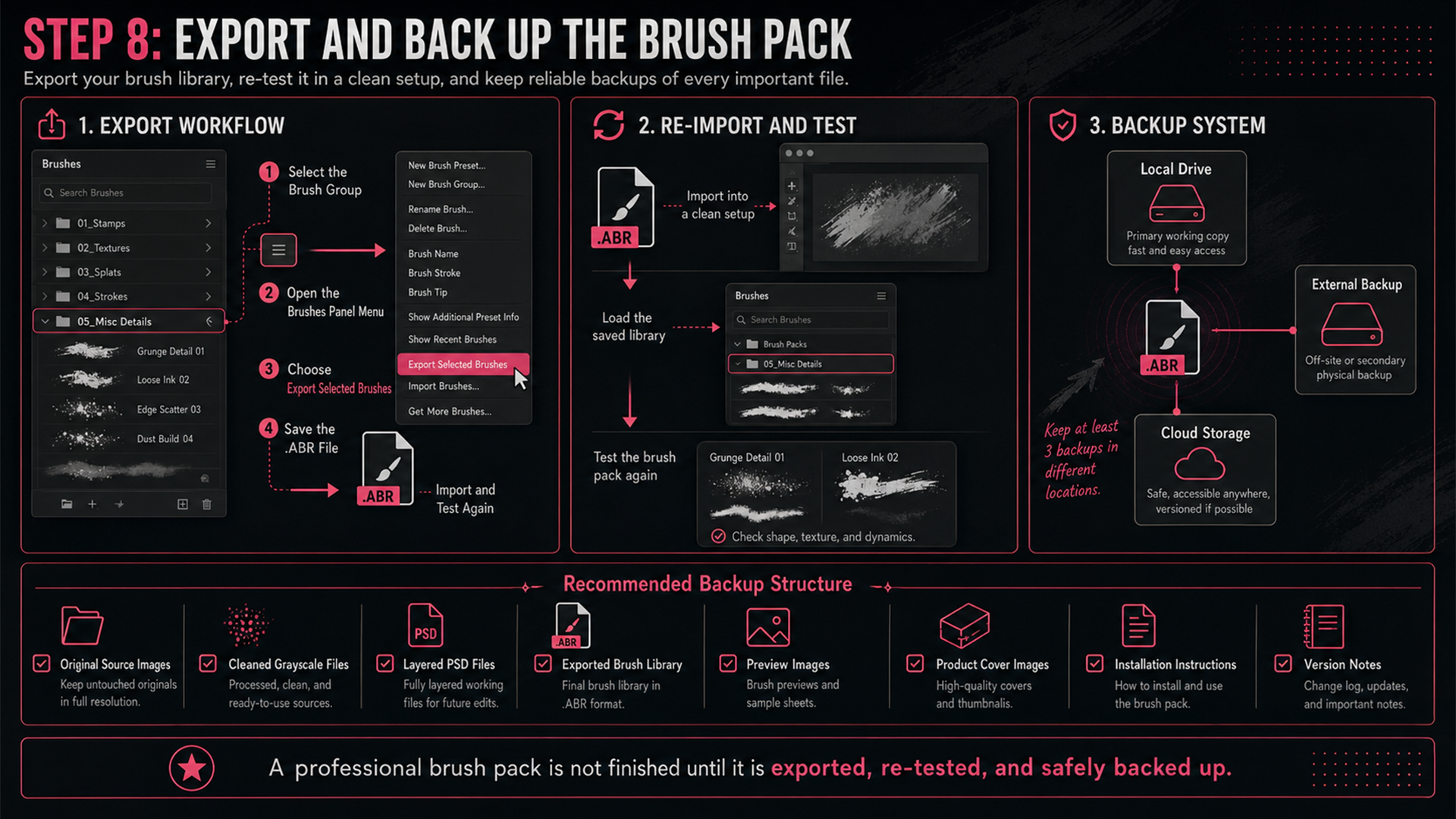
Keep backups of both the exported brush library and the original source files. A professional backup structure might include: original source images, cleaned grayscale source files, layered PSD working files, the exported brush library, preview images, product cover images, installation instructions, and version notes.
Store the files in more than one location — a local drive, an external backup, and cloud storage provide far better protection than a single folder on one computer.
Common Mistakes to Avoid
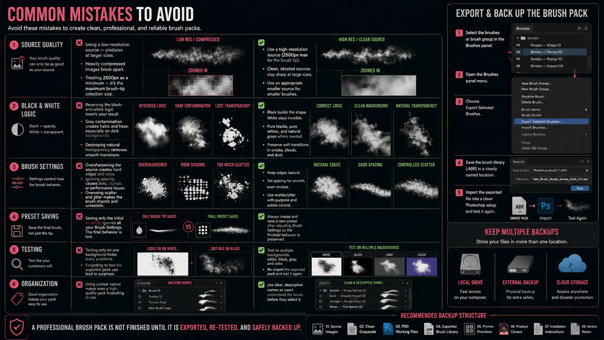
Using a low-resolution source — a small or heavily compressed source will visibly pixelate at larger brush sizes
Treating 2500px as a minimum — it's Photoshop's maximum brush-tip selection size; smaller brushes should use an appropriately smaller source
Reversing the black-and-white logic — black creates opacity, white becomes transparent; building the source backward inverts your intended result
Leaving gray contamination in the background — faint gray areas create halos and haze, especially on dark backgrounds
Destroying natural transparency — not every gray pixel is a mistake; smoke, clouds, and dust need smooth tonal transitions
Oversharpening the source — creates hard edges, noise, and unnatural texture
Ignoring spacing — poor spacing creates visible dots, clumps, or performance issues
Overusing scatter and jitter — randomness isn't automatically realism; variation should support the subject, not obscure it
Saving only the initial brush tip — always save a new preset after adjusting Brush Settings so the finished behavior is preserved
Testing only on one background — a brush that looks clean on white may show obvious artifacts on black
Using unclear names — poor naming makes even a high-quality pack frustrating to use
Forgetting to test the exported pack — always reimport and test the exported library as a customer would
A Professional Brush-Creation Checklist
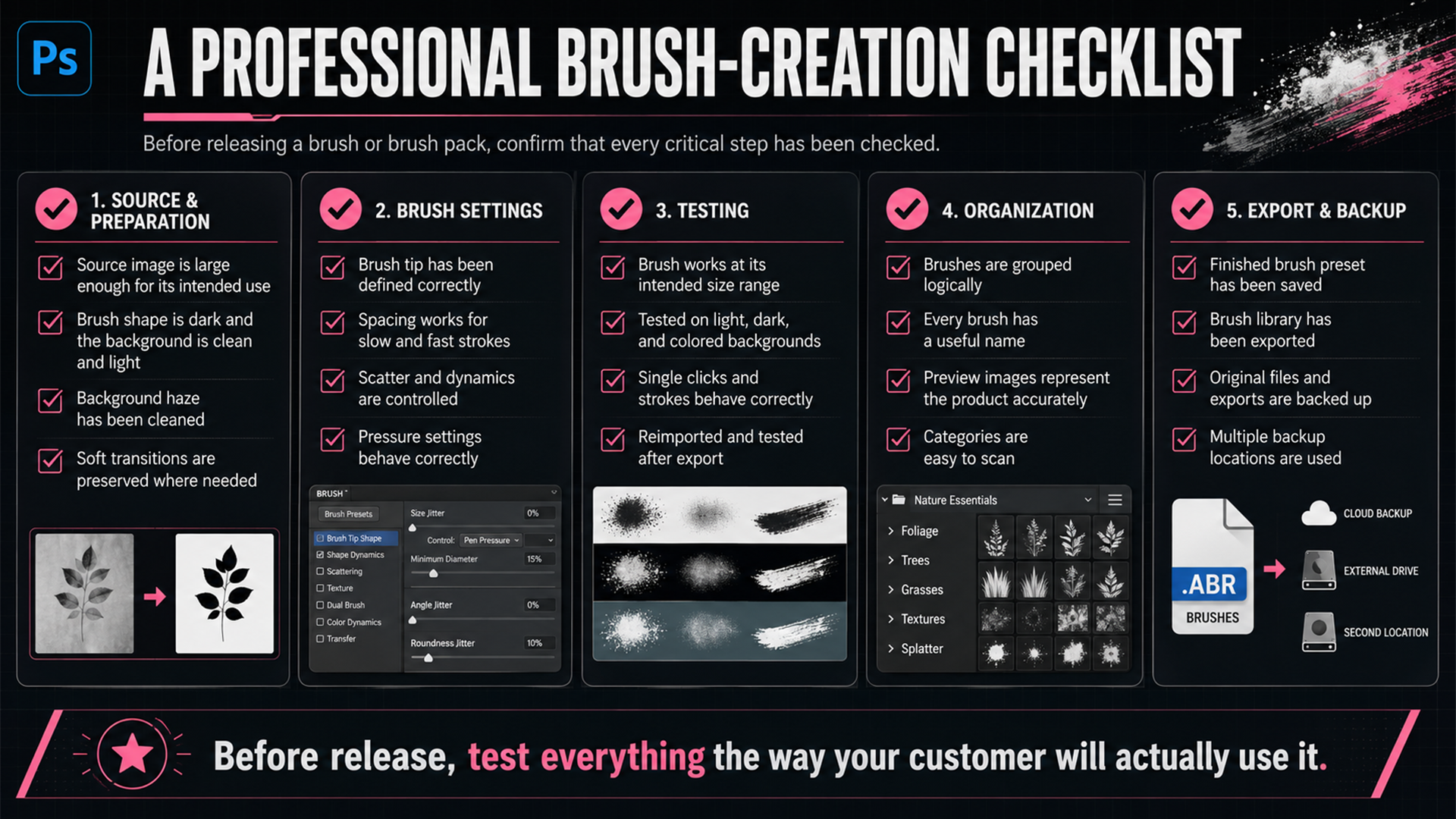
Before releasing a brush or brush pack, confirm that:
The source image is large enough for its intended use
The brush shape is dark and the removable background is clean and light
Unwanted background haze has been cleaned
Soft transitions have been preserved where necessary
The brush tip has been defined correctly
Spacing works for both slow and fast strokes
Scatter and dynamics don't look overly random
Pressure settings behave correctly
The brush works at its intended size range
It's been tested on light, dark, and colored backgrounds
The finished brush preset has been saved
Brushes are grouped logically
Every brush has a useful name
Preview images accurately represent the product
The exported brush library has been reimported and tested
Original files and exports are backed up
Where to Go From Here
Creating one Photoshop brush teaches you the mechanics. Building a large brush library that stays consistent, easy to browse, and reliable in real projects requires a complete system — every decision matters, from the quality of the source image and grayscale values to spacing, dynamics, testing, naming, previews, categories, and export workflow.
You can build that system yourself using the process in this guide. But if you'd rather start from a large collection of ready-to-use brushes without spending weeks creating, testing, naming, and organizing them:
👉 Explore Rafz Brush Studio — 732 Premium Photoshop Brushes across 9 main categories and 35 sub-categories, at rafzvisuals.com/store/rafz-brush-studio-732-premium-photoshop-brushes
Comments (0)
No comments yet — be the first.